Avis Molt ︎︎︎
2020
typography typeface letterforms book cover billboard typography typeface letterforms book cover billboard
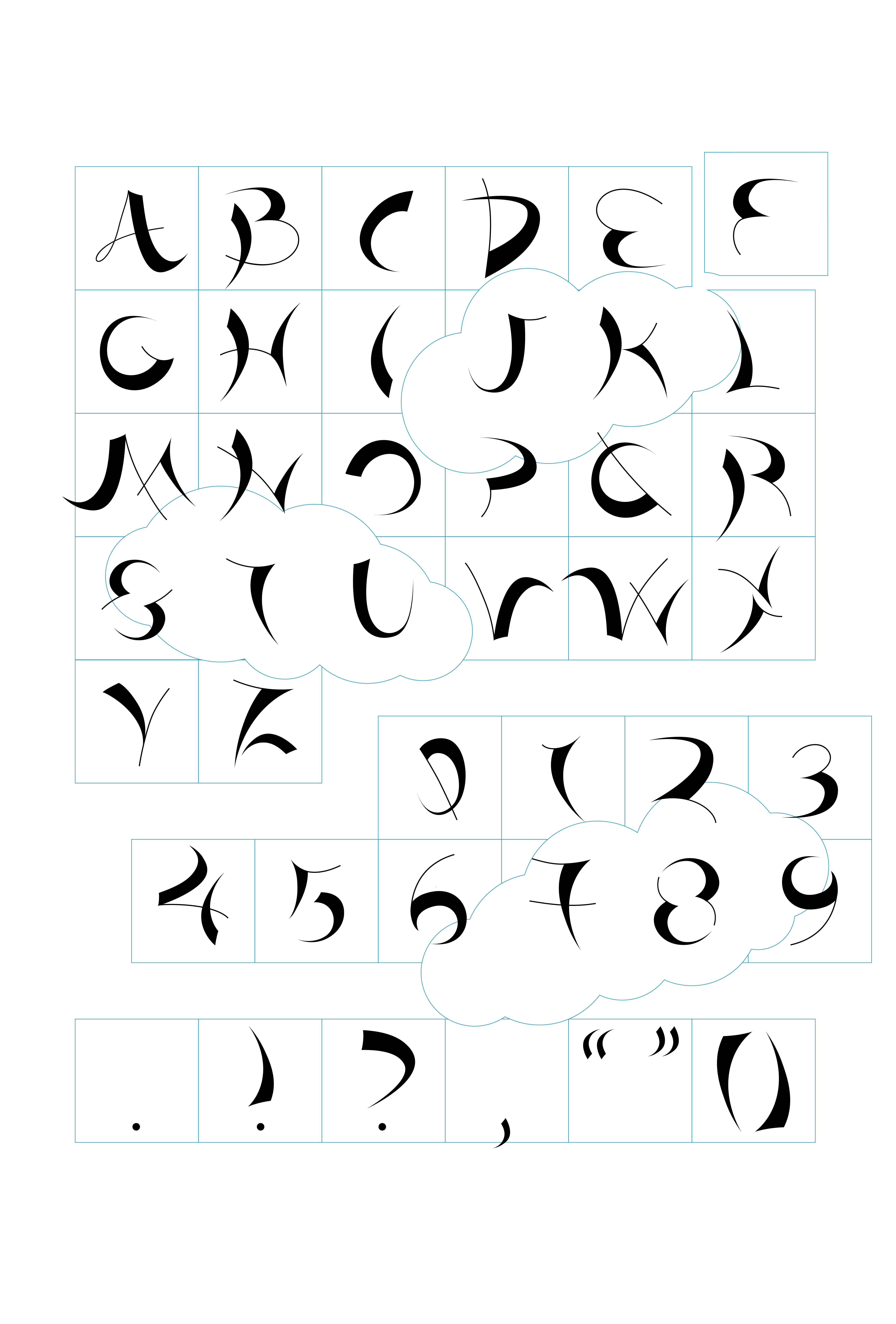
Avis Molt is a display typeface which borrows visual characteristics from the distinct silhouettes and motion of birds against the sky. The title alludes to a flock of birds’ molting season, in which they shed their feathers before migration, with avis being the Latin term for these feathered creatures. This idea of renewal and shedding a former self is the inspiration for Avis Molt, which can appear free and in-motion when displayed in a fluid layout or restricted when bound within a grid or a more traditional layout.


The typeface resembles flying birds, with hairlines reinforcing the endless motion during this transformative phase. The thick stems and strokes resemble distant bird silhouettes when paired with the hairlines and appear feather-like when they stand alone, reinforcing this molting aesthetic and creating a fluttery and dynamic composition when the letterforms are incorporated within an artifact designed outside of a traditional grid.
The concept of transformation and escaping pre-determined structural systems arose from my discomfort with designing outside of a set of strict rules and geometry. This typeface represents the challenge that I encountered with creating a typeface that foregoes traditional rules by being specifically designed to look uncomfortable and even somewhat illegible when aligned to a baseline. Avis Molt represents the shedding of a restricted self and revealing a sense of individualism.


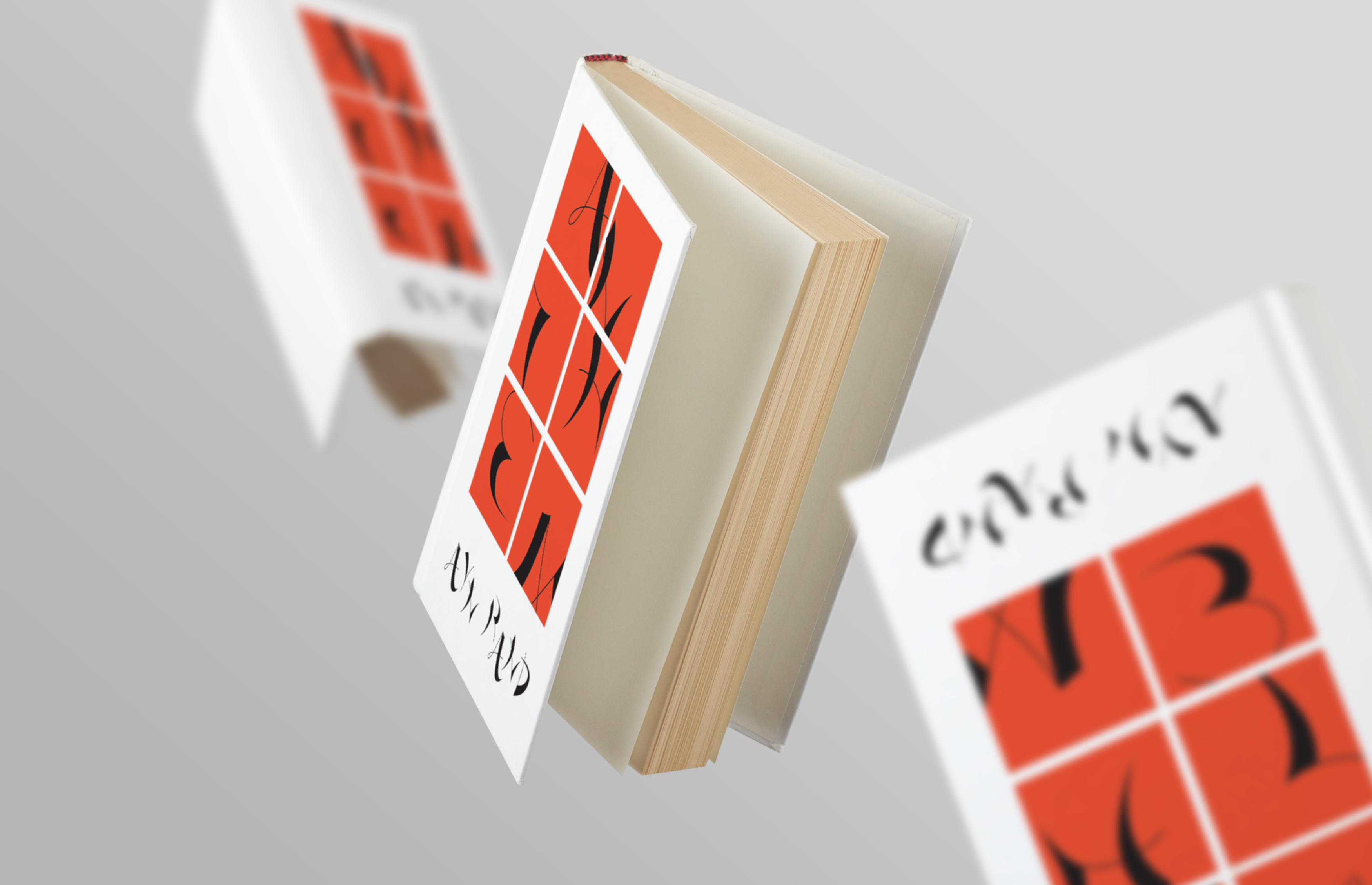
Anthem Book Cover
Ayn Rand’s Anthem portrays a future dystopian society where concepts of individualism have been completely abolished. This book cover represents a window into this dystopian world, where Avis Molt letterforms represent birds who are constricted within a grid a boxes.


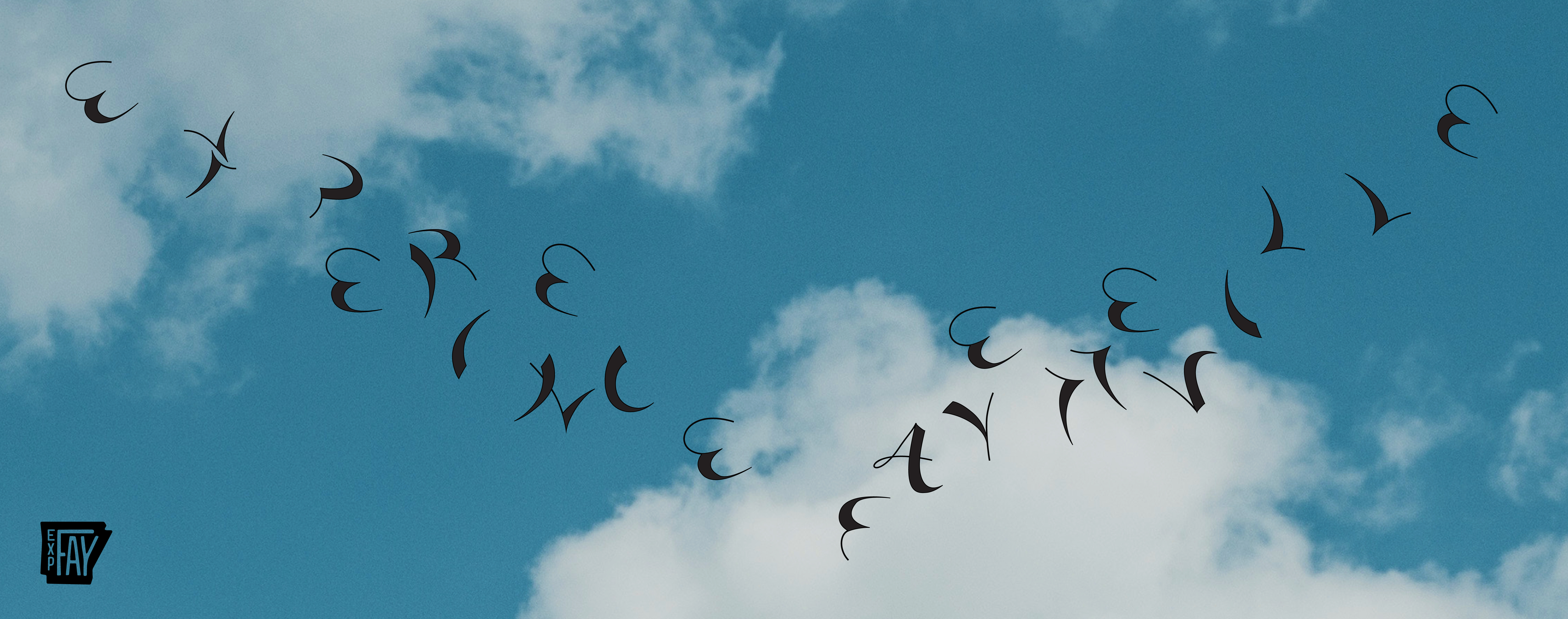
Experience Fayetteville Billboard
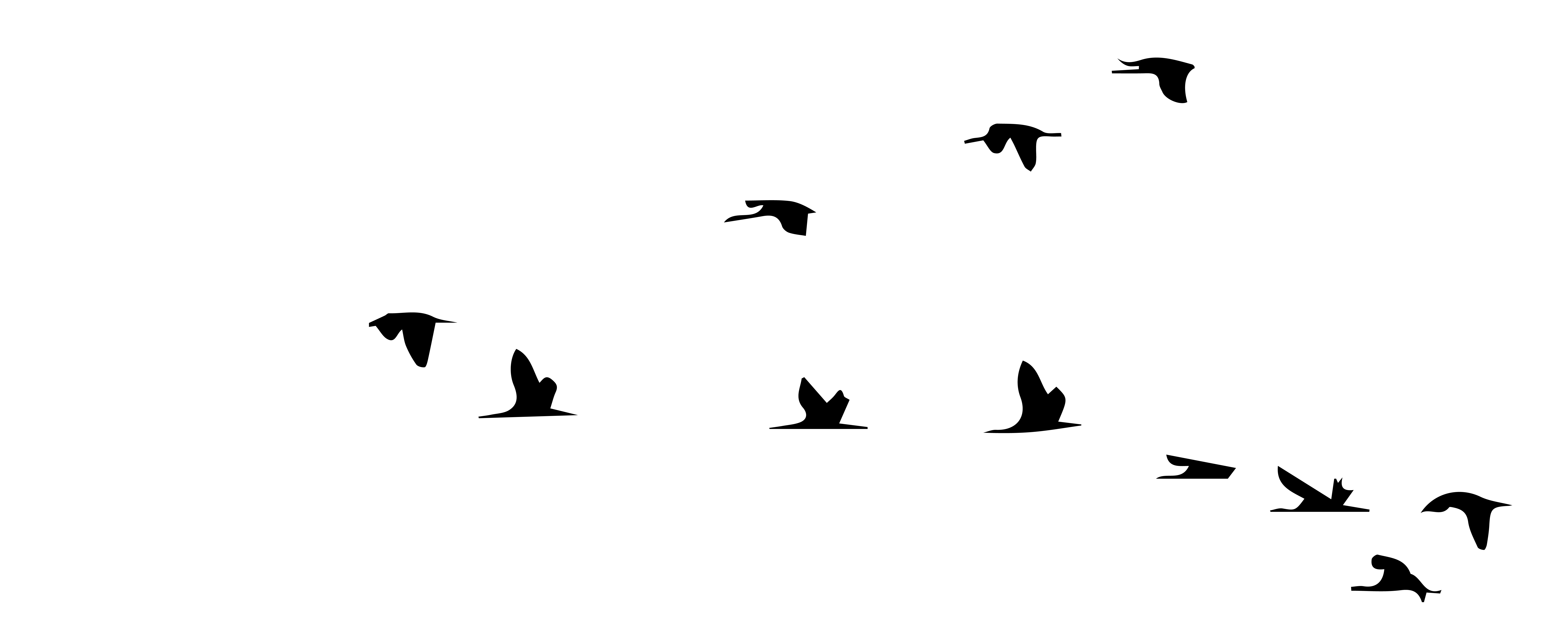
In stark contrast to the Anthem book cover, the fluttery letterforms are freed from the grid and used more expressively. While many of the letterforms do not blatantly mimic a silhouetted bird, the avian aesthetic qualities are emphasized by this design which spells out “experience Fayetteville” in the famous V formation that migrating flocks create in order to catch the previous bird’s updraft and conserve energy for the journey.
