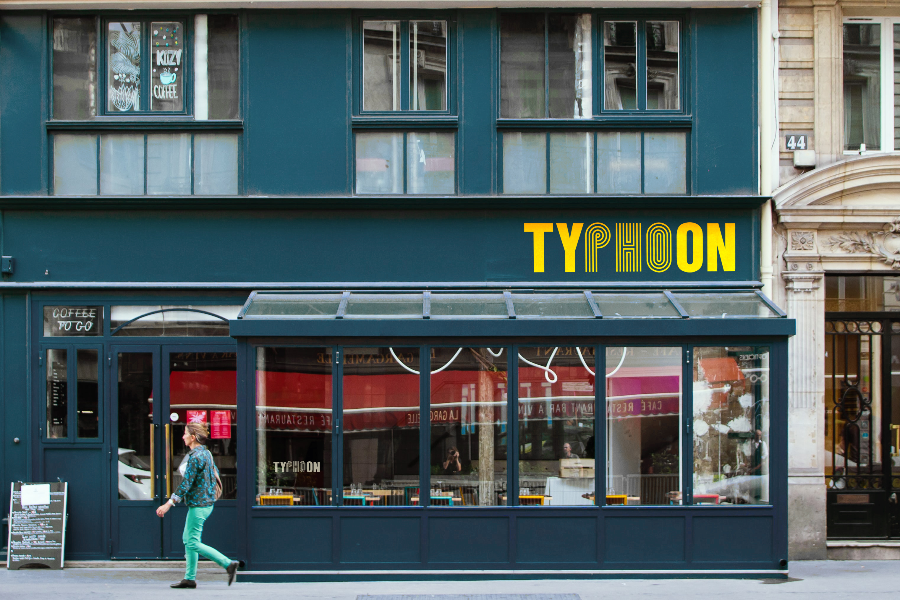
Typhoon Vietnamese Cuisine ︎︎︎
2018
identity branding menu pattern logo identity branding menu pattern logo
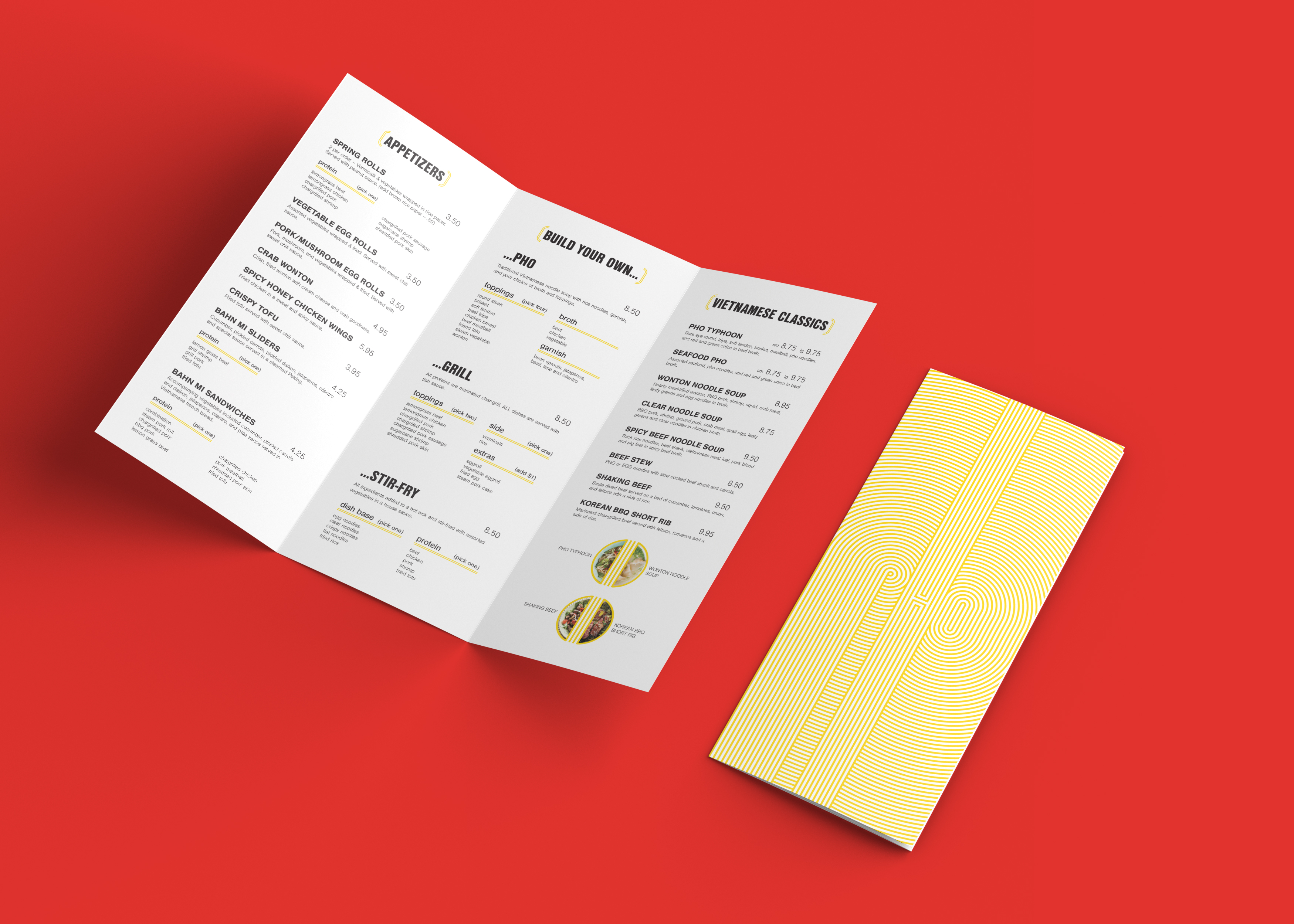
Typhoon is a Vietnamese restaurant which specializes in pho. Their goal is to inspire locals to enjoy Vietnamese culture through authentic cuisine. The name is a play on their specialty dish “pho” and the tropical storm which frequents Vietnam. The objective for this identity is to represent the culture through a visual language which feels familiar and comfortable to locals, as opposed to intimidating, in order to encourage a new demographic to experience Vietnamese culture through food.
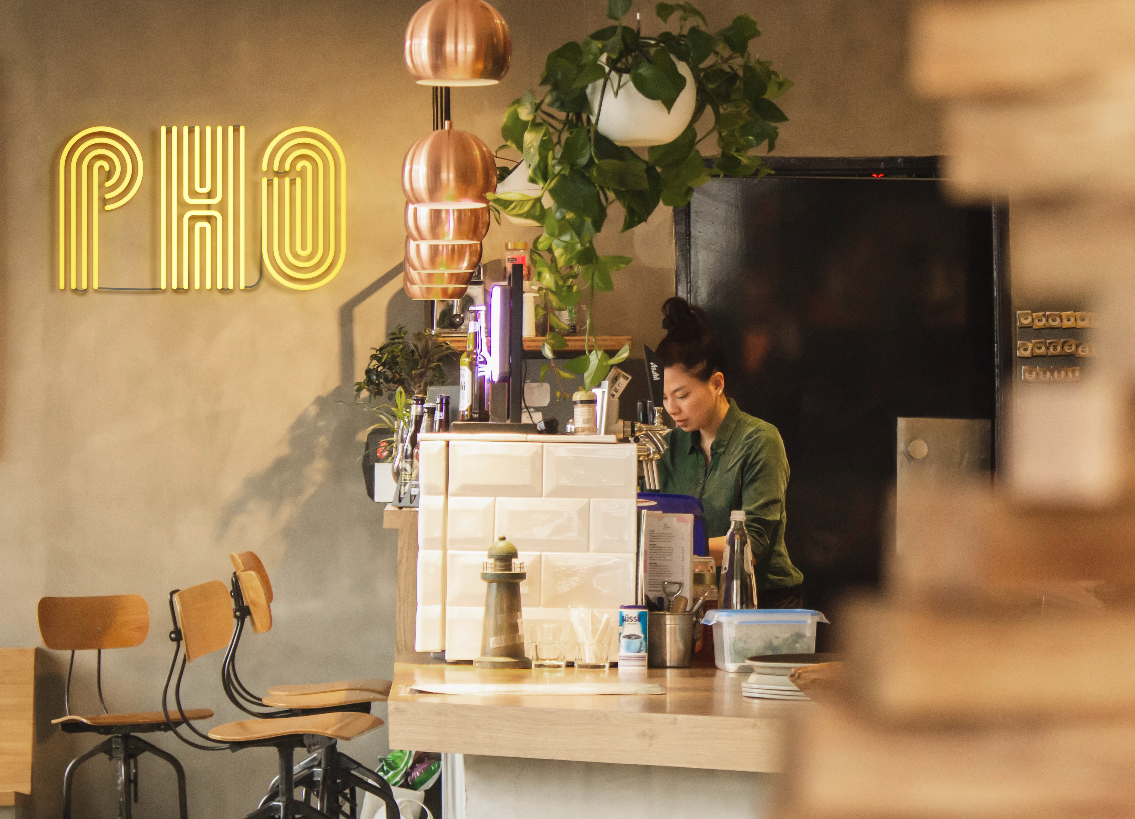
The visual identity for Typhoon began with the visual connection between a bird’s eye view of a typhoon and a bowl of pho. The ‘PHO’ letterforms are defined by parallel lines and the spaces in between, resembling noodles hanging from a pair of chopsticks. These letterforms are either extended, or carried out into a radiating circular pattern which shares visual language with both the radiating pattern of a typhoon and the noodles in a bowl of pho broth.